 Prints help make life fun. Polka dots, florals, checks, batiks, abstract designs — all add dimension to applique projects. We’ve collected our top tips for choosing them and using them:
Match the scale of the print to the size of the applique. Small appliques call for small prints, otherwise the pattern will overwhelm the applique, and you won’t be able to perceive the shape of the applique clearly against the background. Larger appliques can accommodate larger prints.
Make sure the color of the applique print contrasts with the background fabric. The applique should stand out easily against the background, whether it’s a giraffe or a dove. The two fabrics don’t have to contrast sharply, like an orange against a blue. A more subtle contrast like a light blue against a dark blue can be enough.
Aim for one predominant color with secondary colors providing texture.The consistent line of color around the edge of the applique helps make the shape clear. If some colors on the applique run into the colors on the background, you can help define the shape of the applique by finishing the edges with a thread color that contrasts with the background. The dove applique in the photo is an example. The dove fabric is predominantly green, and the background is predominantly yellow, but both prints have enough white in them that when placed against each other, the white flowers of the dove fabric ran into the white polka dots of the background, obscuring the edges a bit. So instead of finishing the edges with a neutral color thread, as with the aleph bet letters you can see a bit of on the sides of the photo, we used green thread.
Consider choosing a print with a texture that suggests the texture of the applique object. For example, take a look at the image at the top of the blog post. It’s part of an idyllic Promised Land landscape from a project in the Sew Jewish book. You can see how the fabrics’ prints help communicate a meadow with flowers and, on the left beyond the meadow, a field of wheat. If you’re after a more abstract look, the print doesn’t have to resemble reality at all — think of a purple meadow or polka dotted hillside.
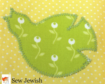 When cutting out your appliques, keep your eye open for unintended effects. Occasionally, the part of a print you choose for an applique will look like something you didn’t anticipate. A section of a flower might look like a face, for example, but you won’t realize it until you place the applique pattern on the fabric or cut it out. If the effect distracts from the effect you’re trying to achieve, cut a new applique from a different part of the fabric. Or, if the effect adds interest or meaning, embrace it. For example, when cutting out the dove applique in the photo, I realized that the bulb of the flower could look like an eye, so I made a point of placing the applique pattern on the fabric in such a way as to give the dove an eye (by the way, you can print this free dove pattern here).
I can’t wait to share all the details of these projects with you!
Update: The Sew Jewish book is now available in the Sew Jewish Etsy shop.
 Maria Bywater is the author of Sew Jewish, available in paperback at Amazon.com and Etsy and available for instant download in PDF format on Etsy. She teaches hands-on Judaica sewing workshops.
